Creating a new vibrant website that fits the demographic, alongside forming a marketing plan and creating many graphics for social media and company documents.
Role
Employer
Platforms
Areas
Design Consultant
Vasari Design
Desktop/IOS
Design/Marketing
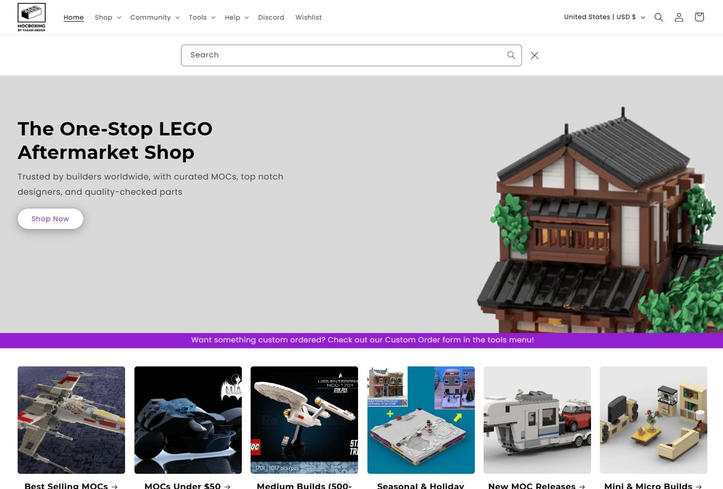
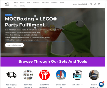
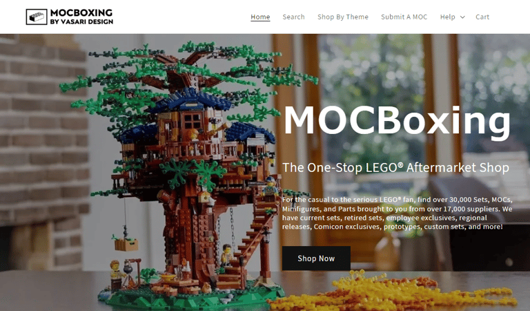
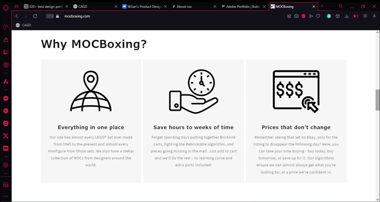
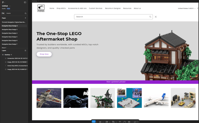
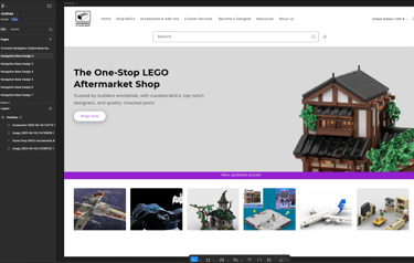
Landing Page of MOCBoxing - 03/2025
Background
From mid 2023 to mid 2024 I took year or so out to travel around East Asia after graduating from university and spending a year in a chef job to save funds.
Towards the end of this trip in Japan I befriended a man with which had a spectacular growth mindset I found interesting, and a go-getter attitude I wanted to surround myself with to keep me motivated. In mentioning this he showed me his online business MOCBoxing (An aftermarket custom LEGO MOC ecommerce store), explained the code behind it but expressed his disliking for his design skill. After a few in person meetings we formed some new ideas and created a list of business goals to try improve the company.
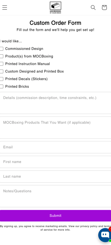
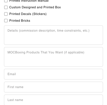
The moment I returned home I started working full time with this man and redesigned whole site and helped ideate some new systems for customers that would make their lives much easier, with empathetic design being my niche, we created some amazing products.
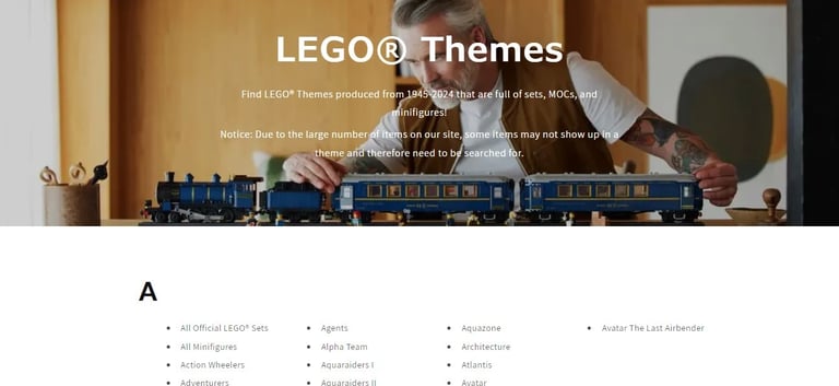
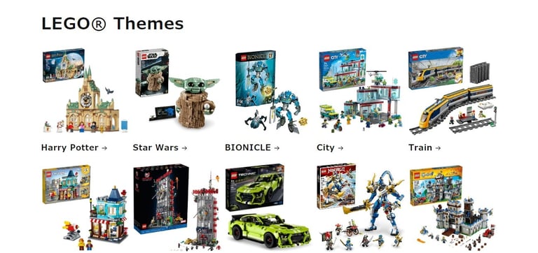
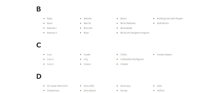
Below are some of the pages of the original MOCBoxing website that I had to change and redesign.
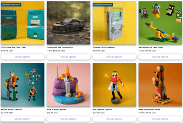
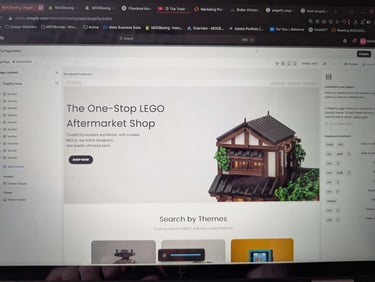
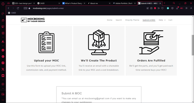
MOCBoxing.com
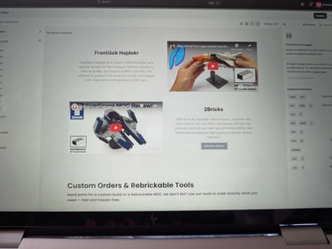
The Challenge
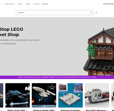
In being honest with myself, I realised instantly this would be a huge undertaking of a task, and will require me to develop new skills I had never even considered gaining. The company had a very basic looking website which I'll place below, not a single order had been sold, there were no instances of marketing and a very finicky code that couldn't guarantee all parts of a LEGO set would arrive.
Some of the main issues I identified were:
Users didn’t understand what a MOC is (This included myself when I visited the site for the first time)
The original site had poor navigation, high bounce rates, and unclear value props
Customers were confused about what they were purchasing (instructions vs. kits)
Lack of trust and visual consistency led to low conversion rates
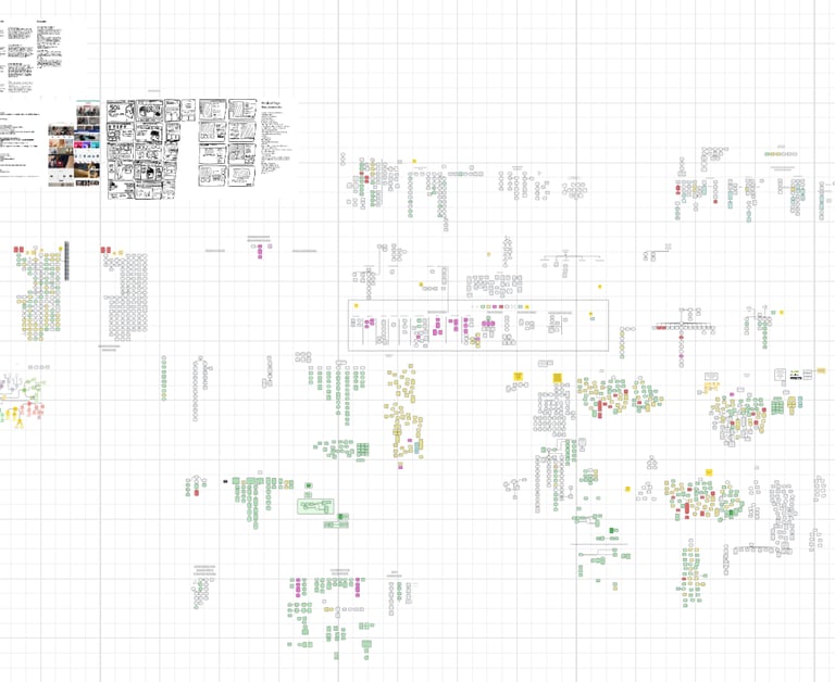
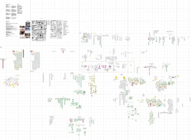
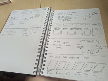
Above is just one of our 2 giant lucidcharts that is one big bit of organised chaos. There's every business plan and design idea in there somewhere.
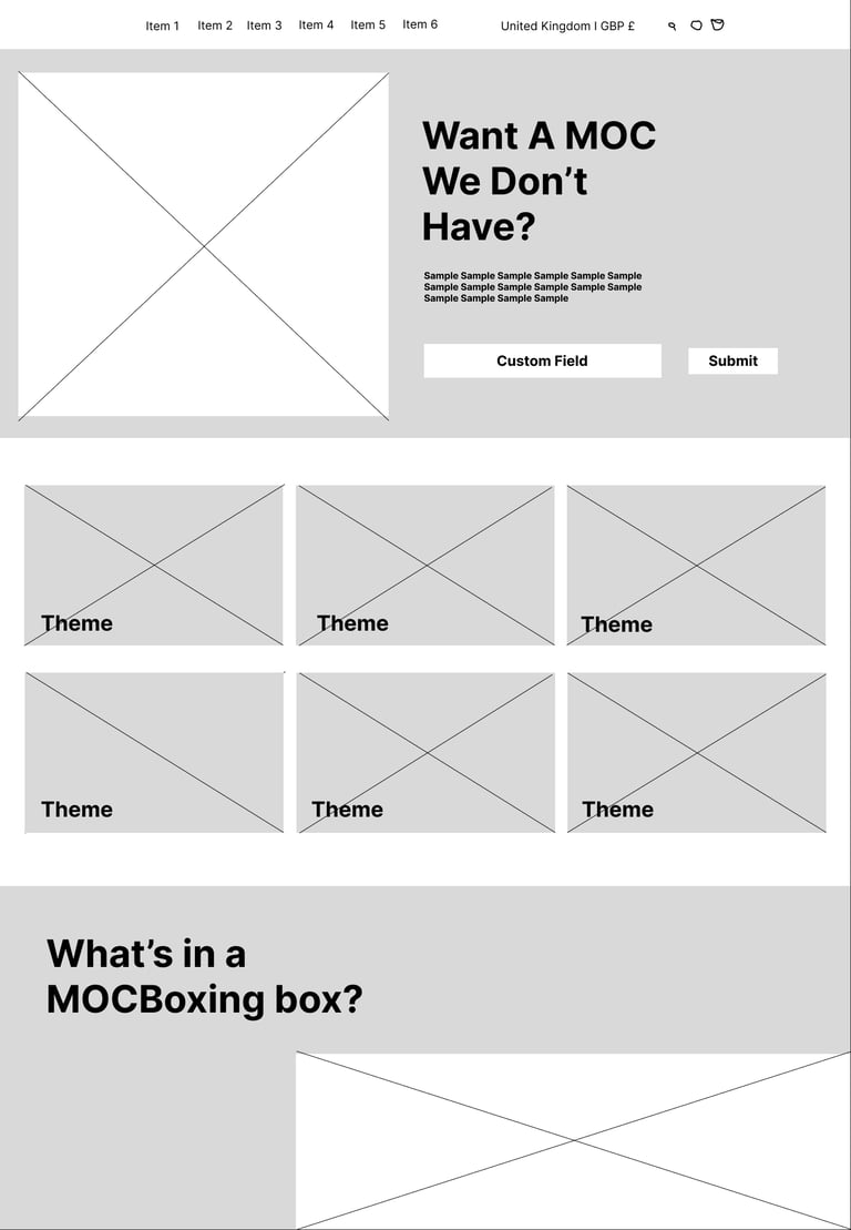
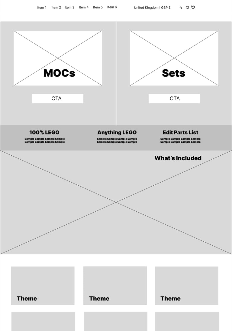
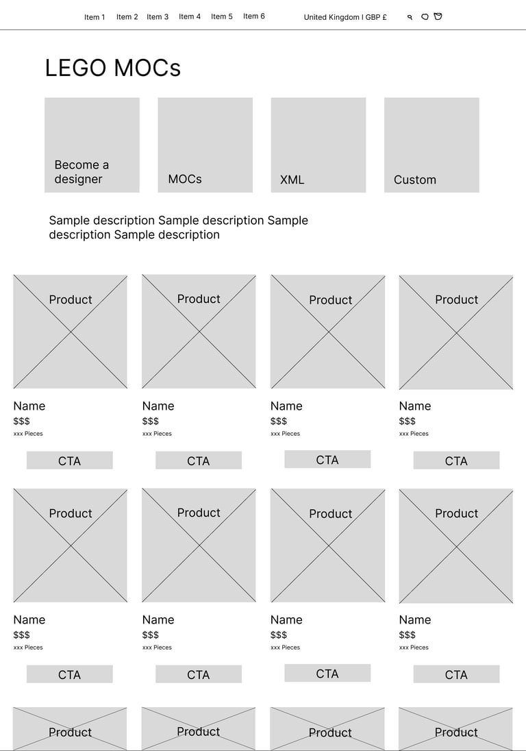
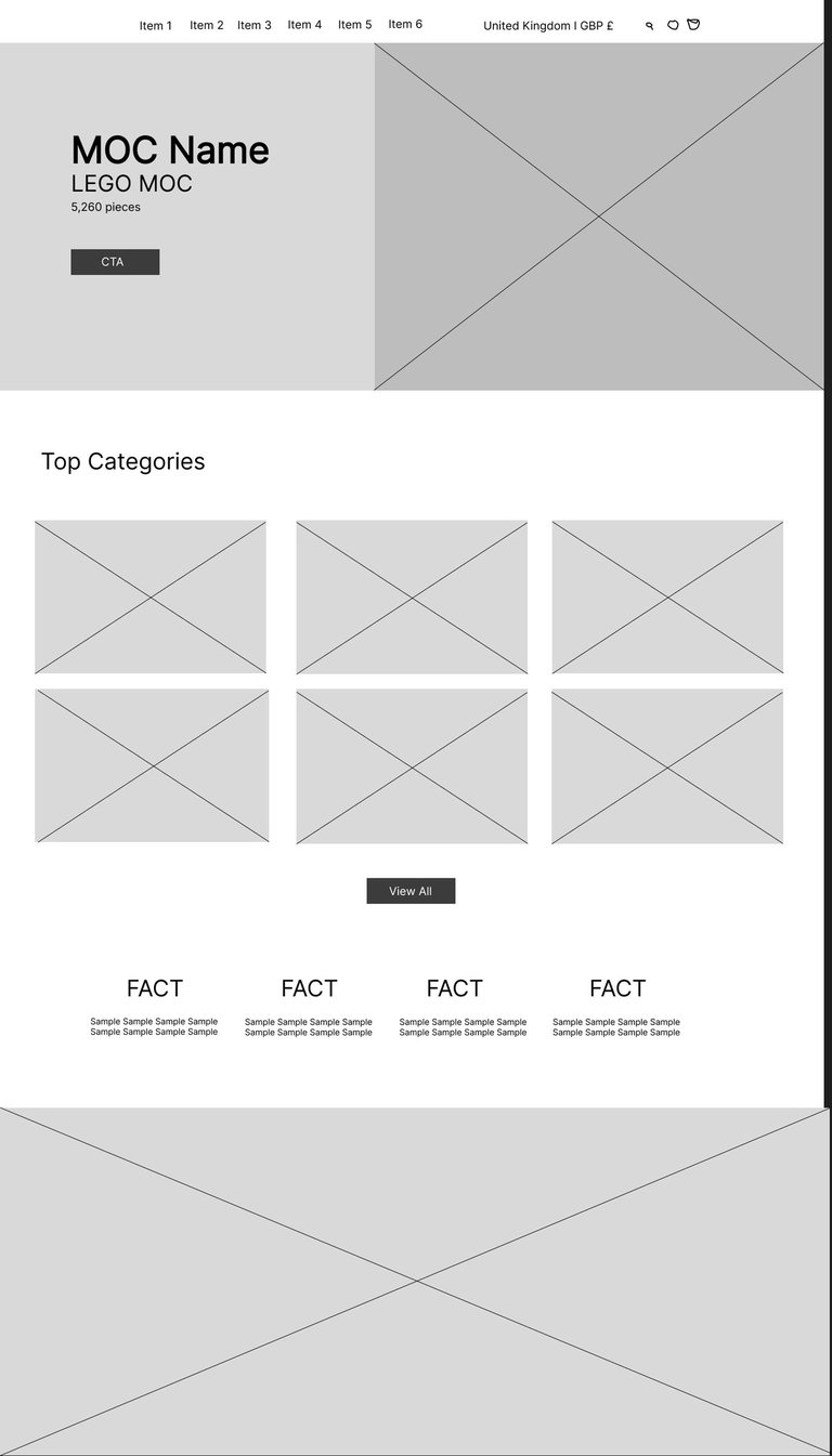
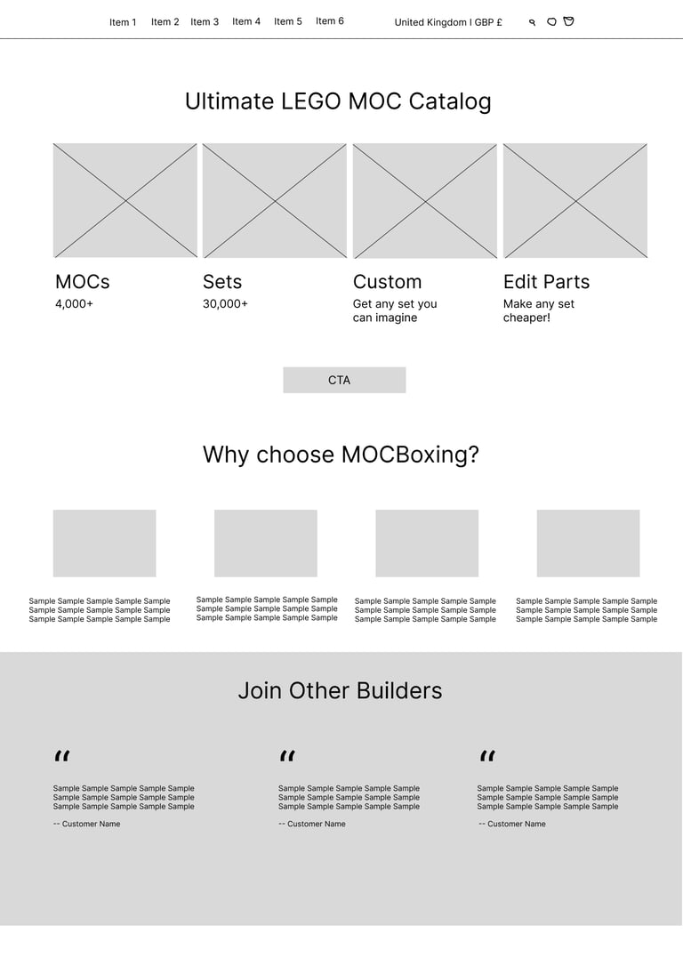
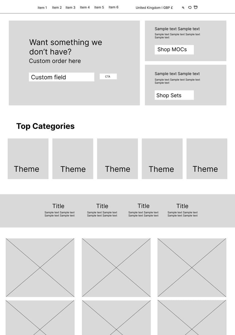
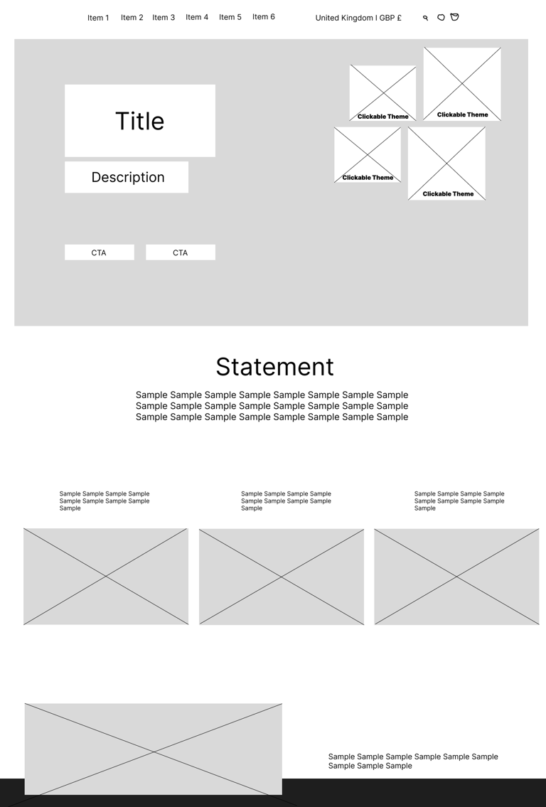
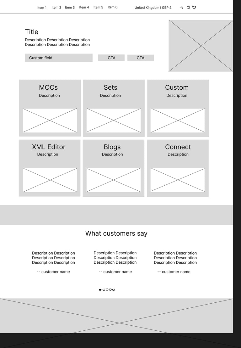
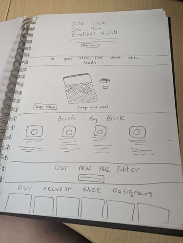
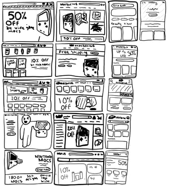
Some wireframes I created using Figma for the landing page that I quickly designed to get my ideas across
Research & Discovery
One huge part of working here is research, as is with any design. When coming into the company the one question I asked right away was "What is the demographic for this company?" LEGO fans was the answer, but I found that to be far too broad and it wouldn't allow for me to produce a design that suits specific age groups or hobby collectives.
So in order to gather some information I interviewed, frankly, a lot of people whether that's industry professionals, average LEGO fans and similar companies to ours that sell similar things (LEGO lighting and accessory companies.)
Reviewed analytics: bounce rate, time on site, conversion drop-off points
Observed customer questions (FAQs, Discord feedback, comments on ads)
Compared competitors: Rebrickable, BrickLink, LEGO.com
Identified key UX problems: cognitive overload, visual inconsistency, lack of guidance
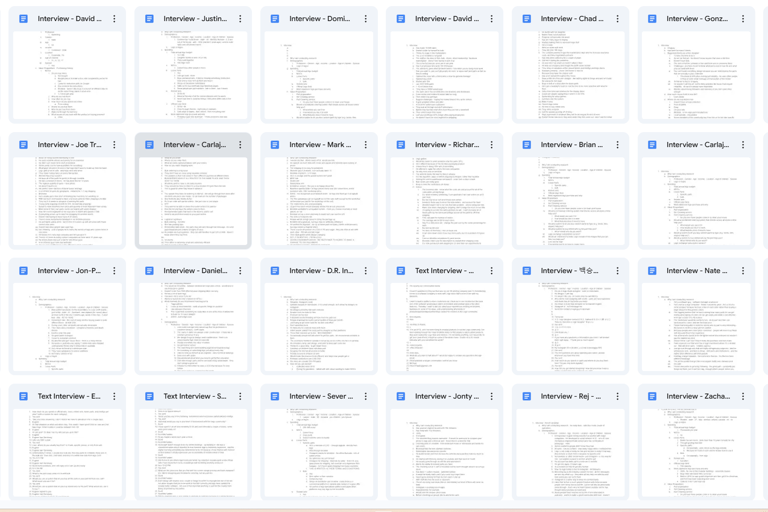
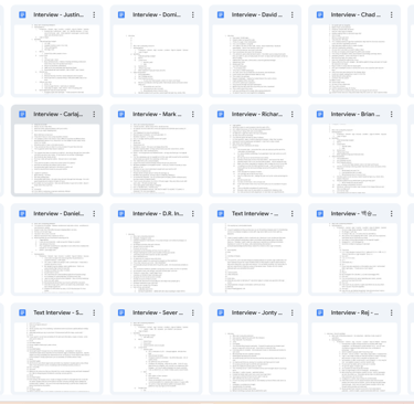
Just a snip it off some of the interviews I produced for research purposes.
UX Strategy & Solutions
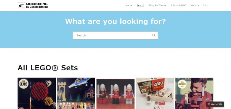
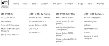
Navigation Redesign
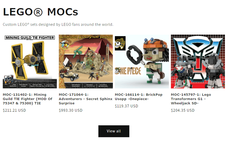
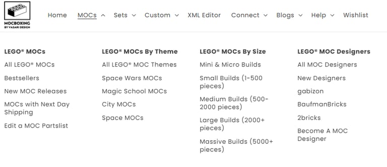
Introduced mega menu for 3000+ products
Organized by themes, popularity, and product type
Added quick access to designers, resources, and kits
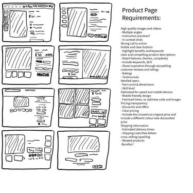
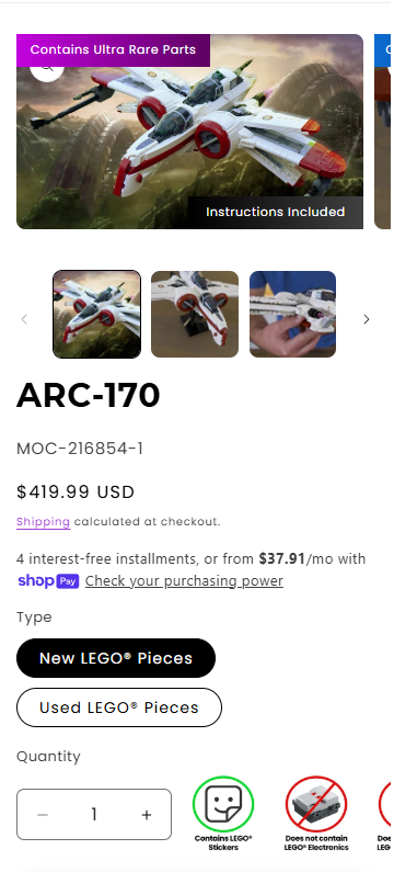
Product Page UX
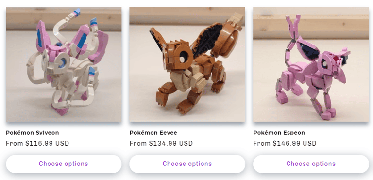
Created new product page layout with tabs for: Overview, Instructions, Parts
Clarified what the user receives (brick kit vs. digital file)
Designed upsells + related MOCs for higher AOV
Resource Hub
Designed an onboarding path for new users:
“What’s a MOC?” → “How It Works” → “Buy Your First MOC”Reduced support queries by anticipating user confusion
Mobile UX
Simplified mobile flow with sticky buttons and thumb-friendly layout
Prioritized mobile responsiveness for traffic-heavy pages

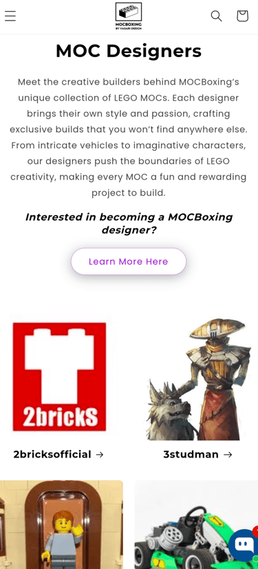
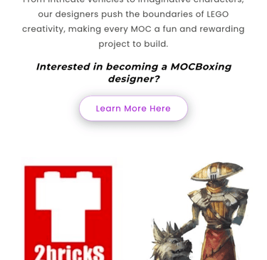
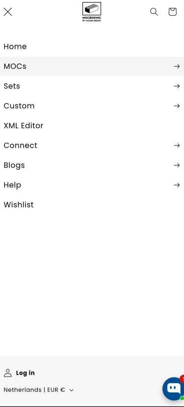
A couple screengrabs of various mobile layouts on the website: navigation, browse products by designers, product page, forms.
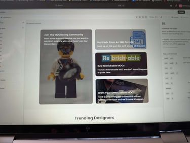
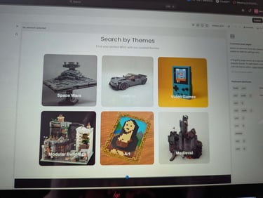
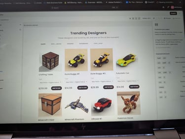
Prototypes / Wireframes / UI Samples